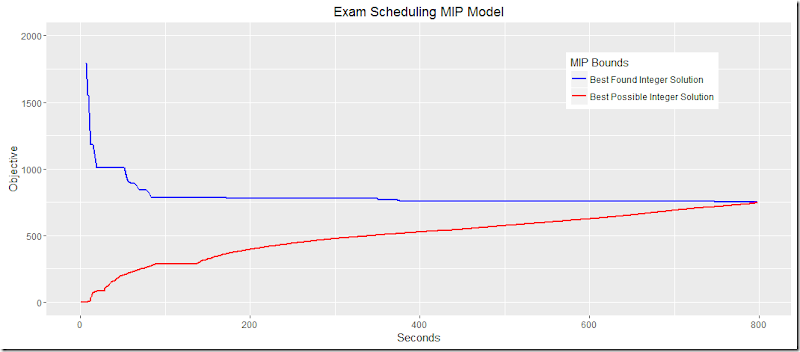
The output of miptrace can be used to plot the MIP bounds. In this post we used it to show the results on an Exam Scheduling Model. After a little bit of clean-up here is a better version:
plot.trace <-function(filename,ylimits,title=basename(filename)){
  hdr<-c("lineNum","seriesID","node","Seconds","bnd1","bnd2")
  df<-read.csv(filename,na.strings = " na",header=F,comment.char="*",col.names=hdr)
library(tidyr)
  df<-gather(df,key=bound,value=Objective,bnd1,bnd2)
  p<-ggplot(data=df,aes(x=Seconds))+geom_line(aes(y=Objective,color=bound),size=1.03)+
    ggtitle(title)+theme(legend.position=c(.8,.8))+
    scale_color_manual(name="MIP Bounds",values=c("blue","red"),
labels=c("Best Found Integer Solution","Best Possible Integer Solution"))
if(!missing(ylimits)){
    p<-p+ylim(ylimits)
}
return(p)
}
plot.trace("c:/tmp/exam3.csv",c(0,2000),"Exam Scheduling MIP Model")
The output looks like:
