One of the problems we face when developing larger scheduling problems is: how do we look at the solution? The solution data is too large to eye ball, and looking at tables with 0-1 decision variables is very difficult.
In the this model, the main variable is x which is a binary variable indicating if a person is assigned to a facility at time t. The GAMS listing file is not a very convenient way to look at this:
I just showed a few records: there are more than 40,000 of them.
The GDX data viewer is showing by default:
This is not much better. We can improve this a bit by pivoting: only look at the levels and display the date dimension as columns:
These are still raw results. We see we have numeric id's instead of more meaningful names. The reason to use the id's is that they are guaranteed unique (they are keys).
To be able get a more compact and meaningful visualization of the results we need to post-process the results. E.g. we prefer names instead of id's. Here I show a visualization in Excel, where we can make create different views. Note: I have anonymized the names in this demo (in the real application we have real names).
Not only is this effort useful to view and understand the results (important to be able to debug the optimization model), but it also allows me to communicate results with the client. Although I ship results in the form of CSV files, to be consumed by a database tool, this CSV file is difficult to interpret directly. This Excel spreadsheet allows us to look at a large, complex solution in much more efficient way. Of course, I have automated things, so after an optimization run, I can generate this spreadsheet using a script.
The advantage of using Excel instead of using a dedicated tool, is that it makes it easier to share results. In the business world, practically everyone is familiar with Excel. Emailing spreadsheets around is much more accepted than sending say executables.
Although creating this tool is not exactly cheap, being able to inspect results in a meaningful way and communicate about them is a big pay off. It is not unusual these tools develop into a more important decision support tool than just a debugging aid for an optimization model.
Developing a mathematical programming application is often much more than just doing mathematical programming.
In the this model, the main variable is x which is a binary variable indicating if a person is assigned to a facility at time t. The GAMS listing file is not a very convenient way to look at this:
---- VAR x assign provider to facility LOWER LEVEL UPPER MARGINAL 5 .7 .Hospitalist .04/01/2019 . . 1.0000 3.0000 5 .7 .Hospitalist .04/02/2019 . . 1.0000 3.0000 5 .7 .Hospitalist .04/03/2019 . . 1.0000 3.0000 5 .7 .Hospitalist .04/04/2019 . . 1.0000 9.0000 5 .7 .Hospitalist .04/05/2019 . . 1.0000 9.0000 5 .7 .Hospitalist .04/06/2019 . . 1.0000 9.0000 5 .7 .Hospitalist .04/07/2019 . . 1.0000 9.0000 5 .7 .Hospitalist .04/08/2019 . . 1.0000 9.0000 5 .7 .Hospitalist .04/09/2019 . . 1.0000 9.0000 5 .7 .Hospitalist .04/10/2019 . . 1.0000 9.0000 5 .7 .Hospitalist .04/11/2019 . . 1.0000 3.0000 5 .7 .Hospitalist .04/12/2019 . . 1.0000 3.0000 |
I just showed a few records: there are more than 40,000 of them.
The GDX data viewer is showing by default:
 |
| Default view |
 |
| Pivot table |
To be able get a more compact and meaningful visualization of the results we need to post-process the results. E.g. we prefer names instead of id's. Here I show a visualization in Excel, where we can make create different views. Note: I have anonymized the names in this demo (in the real application we have real names).
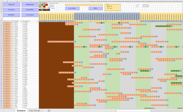 |
| Excel based visualization |
Not only is this effort useful to view and understand the results (important to be able to debug the optimization model), but it also allows me to communicate results with the client. Although I ship results in the form of CSV files, to be consumed by a database tool, this CSV file is difficult to interpret directly. This Excel spreadsheet allows us to look at a large, complex solution in much more efficient way. Of course, I have automated things, so after an optimization run, I can generate this spreadsheet using a script.
The advantage of using Excel instead of using a dedicated tool, is that it makes it easier to share results. In the business world, practically everyone is familiar with Excel. Emailing spreadsheets around is much more accepted than sending say executables.
Although creating this tool is not exactly cheap, being able to inspect results in a meaningful way and communicate about them is a big pay off. It is not unusual these tools develop into a more important decision support tool than just a debugging aid for an optimization model.
Developing a mathematical programming application is often much more than just doing mathematical programming.